
Dharma Art with Tashi Mannox. - A report from Lama Shenpen Hookham.
Lama Tashi Mannox’s Dharma Art workshop with the Awakened Heart Sangha was a great success in all sorts of ways. I enjoyed talking to Lama Tashi in depth about what creativity means in terms of Buddha Nature and how to translate the English idea of creativity in Tibetan. There doesn't seem to have one word for all that creativity means for us in English. I came up with various words that touched on the areas such as lhundrub - ལྷུན་གྲུབ། (usually translated as spontaneous because it is not caused, being complete in itself, all of a piece with the Totality of everything), tsal - རྩལ། (often translated as creative power or essence, the characteristic or intrinsic skill, ability or virtue of a thing), rolpa - རོལ་པ། which is usually translated as play (in all its senses), and gyen - རྒྱན། ( adornment, beautifying feature of a thing). I explained to him what Rigdzin Shikpo teaches about the arising of insight being a movement between the three, tsal, rolpa and gyen. See below.

Lama Tashi’s workshop introduced us to the painting of a circle, called an Ensō in Japanese. The way he teaches it is very similar to how Trungpa Rinpoche taught about the Ashe, the single stroke in his Shambala teachings. Lama Tashi is very inspired by Trungpa Rinpoche’s teachings in general and Dharma Art in particular. He himself trained for eighteen years with Sherab Palden Beru, a very famous Thangka painted who used to live in Samye Ling. He passed away a few years ago aged 101 and was a week in Tukdam (the after death meditation state of great yogins).
Lama Tashi is a world renowned master of the art of Tibetan calligraphy and gets invited to give exhibitions and demonstrations all over the world. We are very lucky to have had this chance to work with him at the Hermitage and look forward to his coming again.
He talked about integration of body, heart/mind, and the environment giving us various exercises to help us link into the vast spaciousness of our being and of Reality itself. The whole exercise of painting an enso expressed this integration and for this we needed confidence. It became very clear as he talked that he was talking about learning to really trust the heart wish, openness, clarity and sensitivity in a direct, precise and spontaneous way without the interference of thought and effort to control the outcome. In this way it was a practical demonstration of all the DHB principles. Meditation in Action.
One feature of this was confidence of the right kind. Not copying something or trying to impress but being very simple, honest and genuine and it involved cutting through fear, letting go of attachment to outcome, integration of inner sphere outer sphere and creative intermediate sphere, integration of clear intention, skill in knowing and using your materials, trusting the spontaneous completeness of the integrated whole.
He gave the example of how the Bhutanese shoot the arrow in archery. They shoot without looking at the target yet can hit it every time. Many years ago Trungpa Rinpoche gave the example of a potter throwing clay. When you throw your clay at the centre of the wheel, you create a perfect pot every time. It is about perfection and beauty that is the wholeness and truthfulness in the execution of the work. It is simply what it is and not pretending to be something else.
This means your intention and vision for the work is clear and complete before you put brush to paper, but how it actually turns out is still a surprise as if it had a life of its own..
The opposite is trying to control the outcome by means of the judging mind that kills the creativity, sensitivity and responsiveness and produces something dead and not beautiful.
What is this creativity in Dharma terms?
Rigdzin Shikpo talks about how insight arises from the play (rolpa) of the mind that has the creative ability or skill (tsal) that can be trained and developed to find (recognise, home in on, spark) beauty (gyen). Insight arises this way be it in mathematics, art or Dharma itself. Play in all senses is needed – relaxation, playfulness, the right touch, willingness to let go of control, restraints, inhibitions and so on. It is play that allows us to find beauty and there is an immediate feed-back as we recognise beauty be it in a mathematical solution, in a work of art or in the truth of the Dharma. We know intuitively that it’s true, right and beautiful before we start to think about why and how. We know in a complete and spontaneous way that just happens. It is nothing to do with us in a way. It arises itself without conceptualising it. This completeness that cannot be analysed but which we know intuitively by its beauty is what lhundrub - ལྷུན་གྲུབ། means. It is all-of-a-piece and cannot be broken up into components. Looking at it after it has been created as if from a single seed of inspiration, one can use many words to describe or explain it. In itself however it is beyond the words that point to it. There is nothing separating the creative inspiration, the artist who expresses it and the creation that expresses that inspiration. It communicates itself to the receptivity (tsal) of another person who shares that sense of non-separation and wholeness. They will feel the beauty and this helps them develop their skill (tsal) for recognising truth and beauty.
In Dharma terms we are talking about the lhundrub qualities of the true nature of the chitta (sems, heart/mind). This is known as the Buddha Nature. These are not qualities that can be analysed and separated from the thing qualified. They are inseparable from the nature of chitta in the sense that if we access the true nature of chitta we will access the source of all the qualities. When we say inspiration in English we are talking about a kind of insight into something beyond words which we then express in some way, maybe in words, art, mathematical formula or self-transformation/liberation.
You could say that ultimately all creativity – truthful or distorted - originates in the true nature of chitta, the openness, clarity and sensitivity of our being.
Over the week-end we noticed that as we held our paint brush over the unblemished sheet of expensive white paper, we felt a sense of excitement and even fear as we made the decision to put brush to paper and complete a circle (Japanese ensō).

I was amazed and delighted by the way Lama Tashi could look at each of our first faltering efforts to create an enso and use them to reflect back to us in positive terms its unique quality – every enso captures a unique moment and in that sense is a whole story in itself. He would then somehow magically transform our work by the placement of the red seal and signature – to bring out that special quality. Watching him do that was a lesson in itself. As was watching him produce his own pieces, together with seal and signature – it produced a visceral learning experience – quite wonderful! All this is not something that just applies to art. It applies to how we live and how we do anything in life - This is what Dharma art is all about.
Thank you Lama Tashi and I look forward to working with you more.
- Lama Shenpen - 27th June 2018.
 |
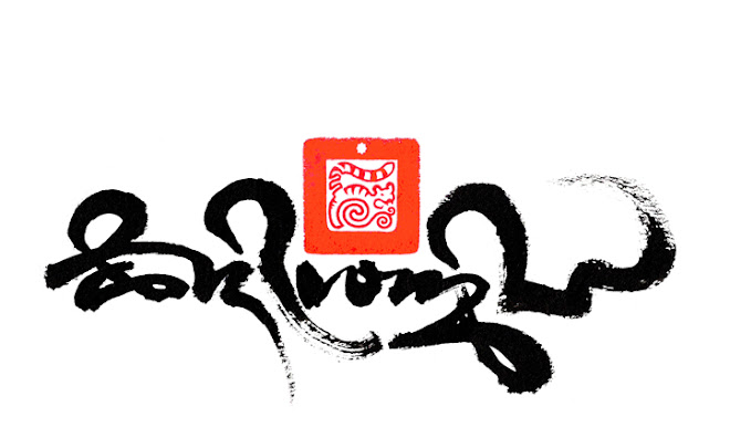
| ལྷུན་གྲུབ། - lhun-drup, gyen, tsal and rolpa - free brush calligraphy - Tashi Mannox - Created at the AHS Hermitage, June 2018 |
The original artwork of the above is available here.


